Graphic Design | Product Mock up | Social Media
Logo Refresh & Creating Merch for Porta Print
With the start of my new position in August, Halsey Festival, which is a chance for businesses in Newark to showcase their work and services to individuals in the area, being around the corner, I needed to prepare Porta Print for it’s first appearance since the beginning of the pandemic. Since I was working on the development of the company’s new website, I though, why not give the logo a “refresh”? While I don’t have the professional skills of a graphic designer, I have no problem finding my way around Adobe Creative Cloud. Here’s a before & after of the company logo.
-
Before
-
After
“Porta is short for Portable. Back then, when meeting up with clients, I’d bring printing catalogs and samples, making the business portable, as if it were on wheels.”
— Peter Learmont, Owner
Thoughts Behind the Design
When thinking of the refresh, I wanted to incorporate some of the things the owner said about his business. I knew that it was important to emphasize that Porta Print Publishing is still portable, in the sense that it always accessible. In the refresh, I decided to give the logo newer colors and bring back the circle around the P.
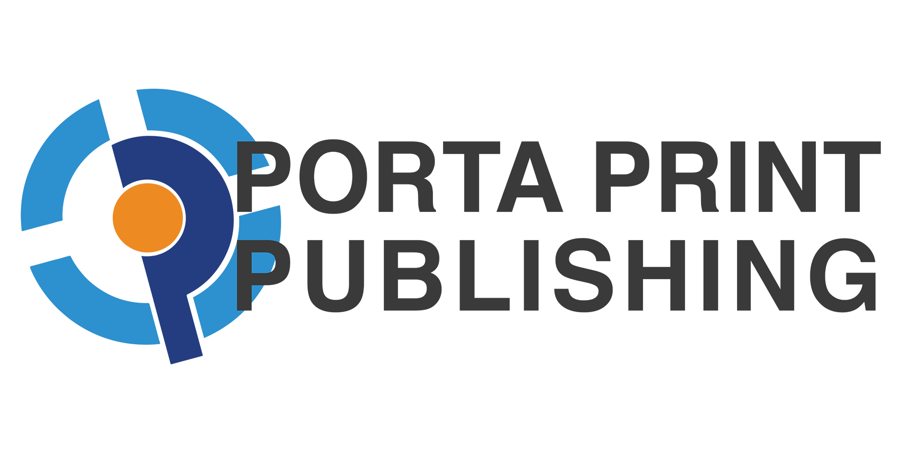
Porta Print Publishing Written Logo

Porta Print Publishing Logo
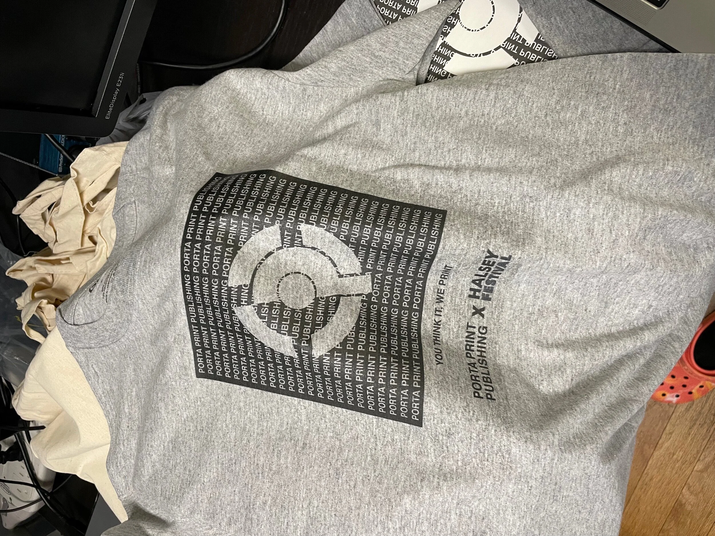
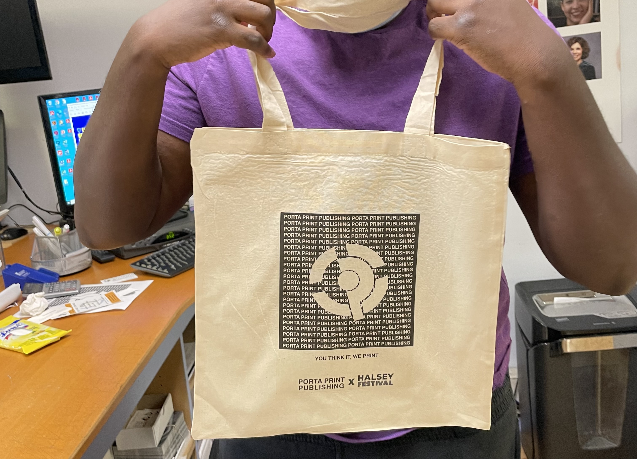
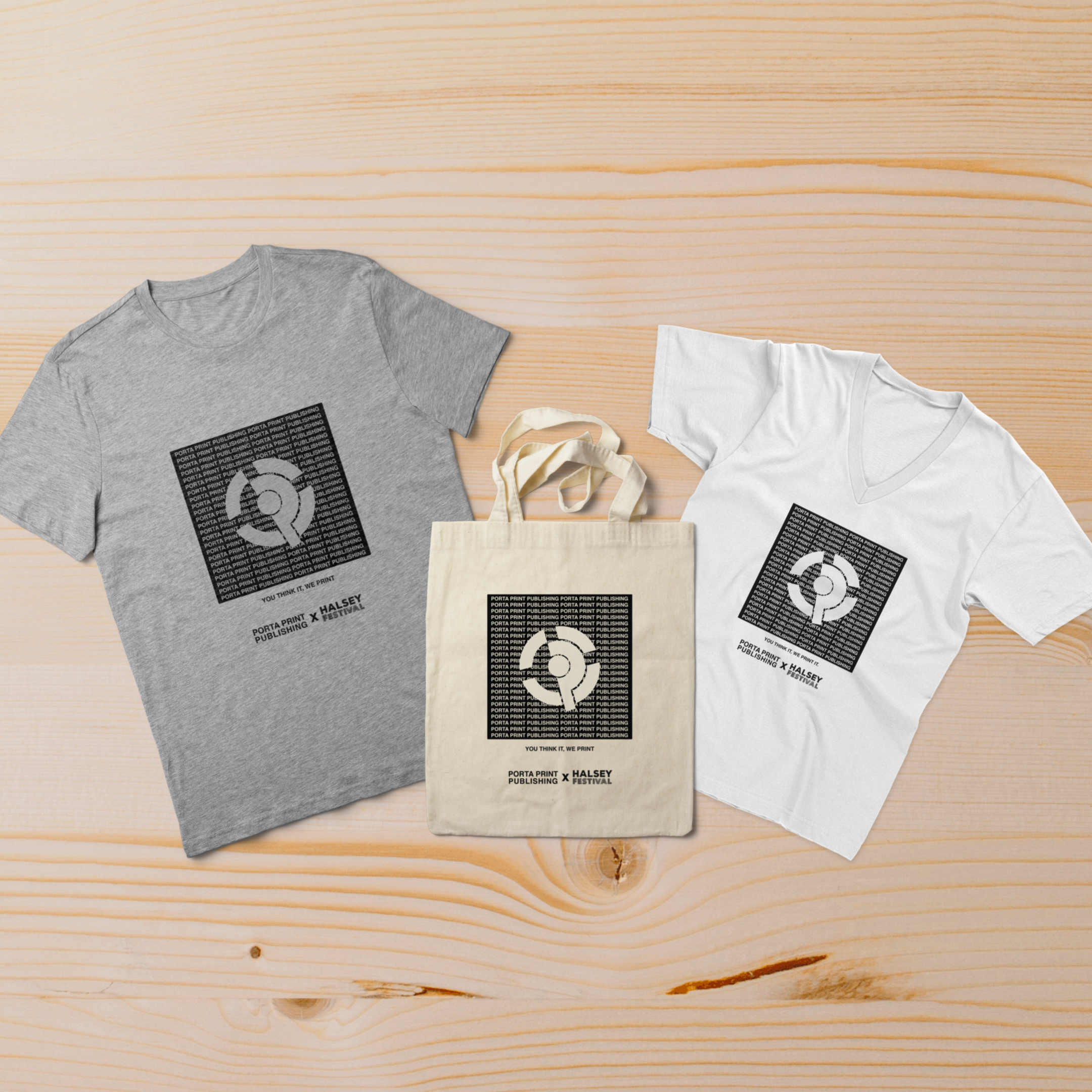
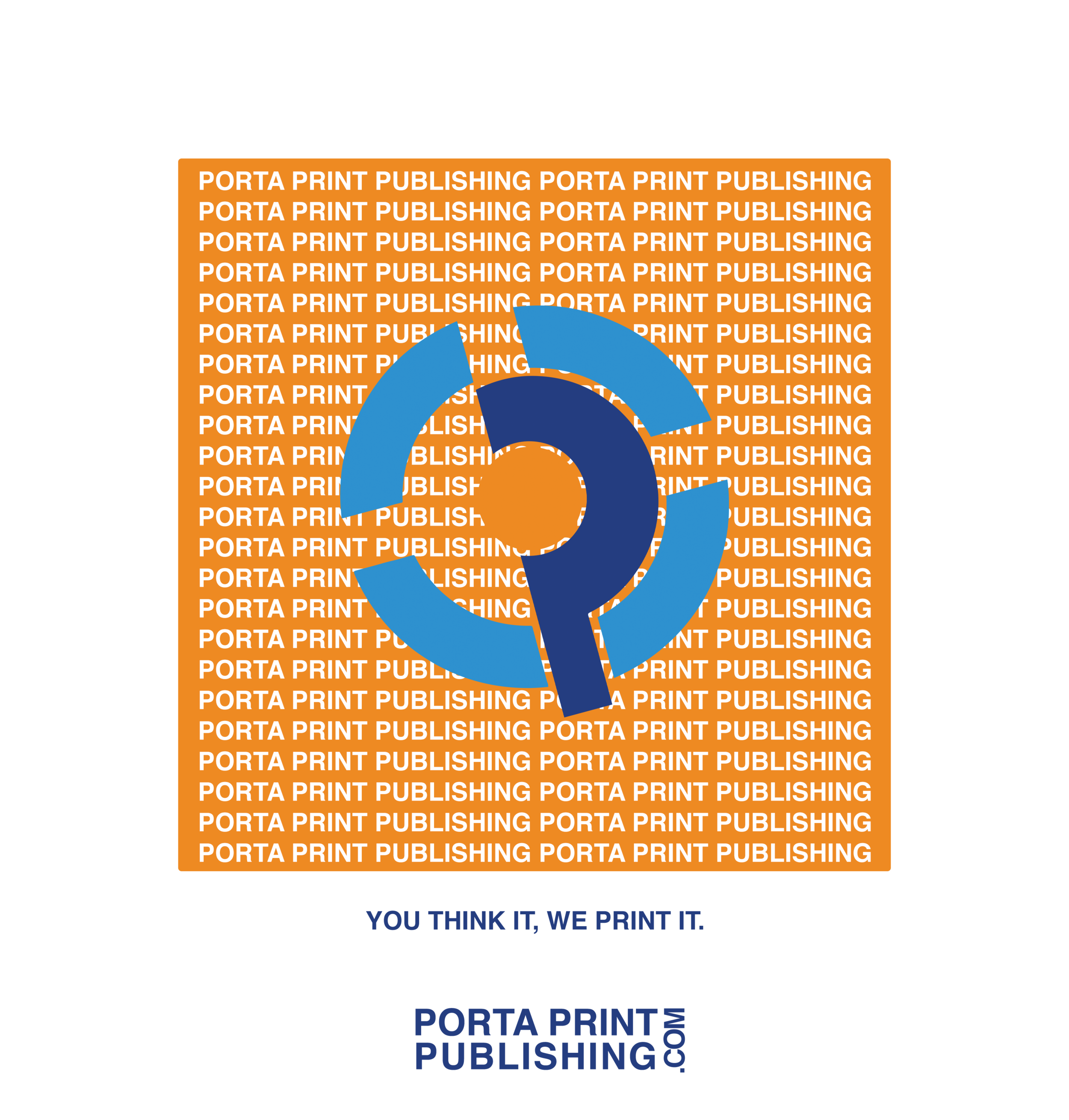
Creating Merchandise
With the Halsey Festival approaching, I wanted a way to give Porta Print Publishing a chance to shine. I wanted to create merchandise that people can feel comfortable using and wearing in order to spread awareness of the company.
Out of my free time, I designed this:
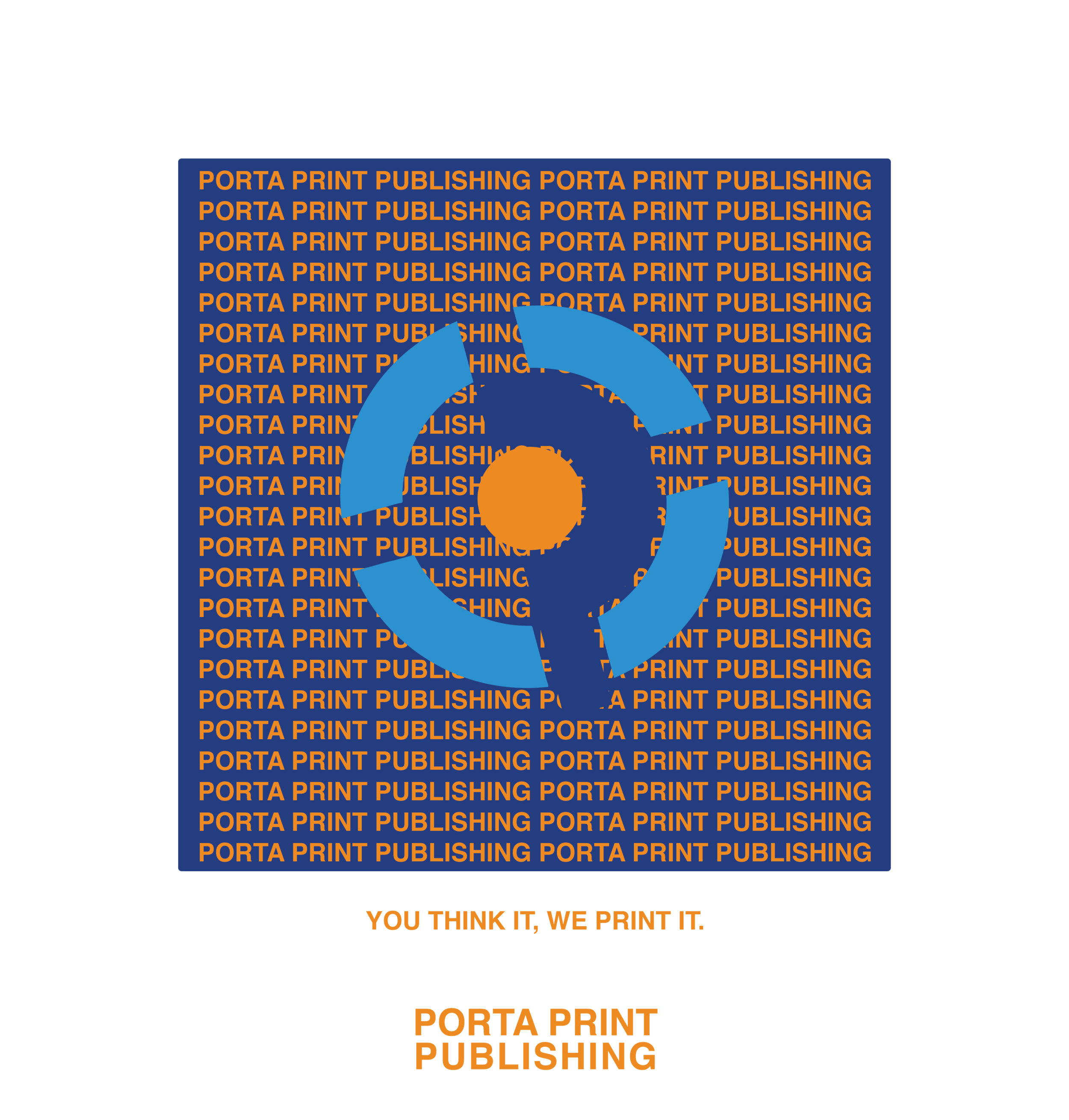
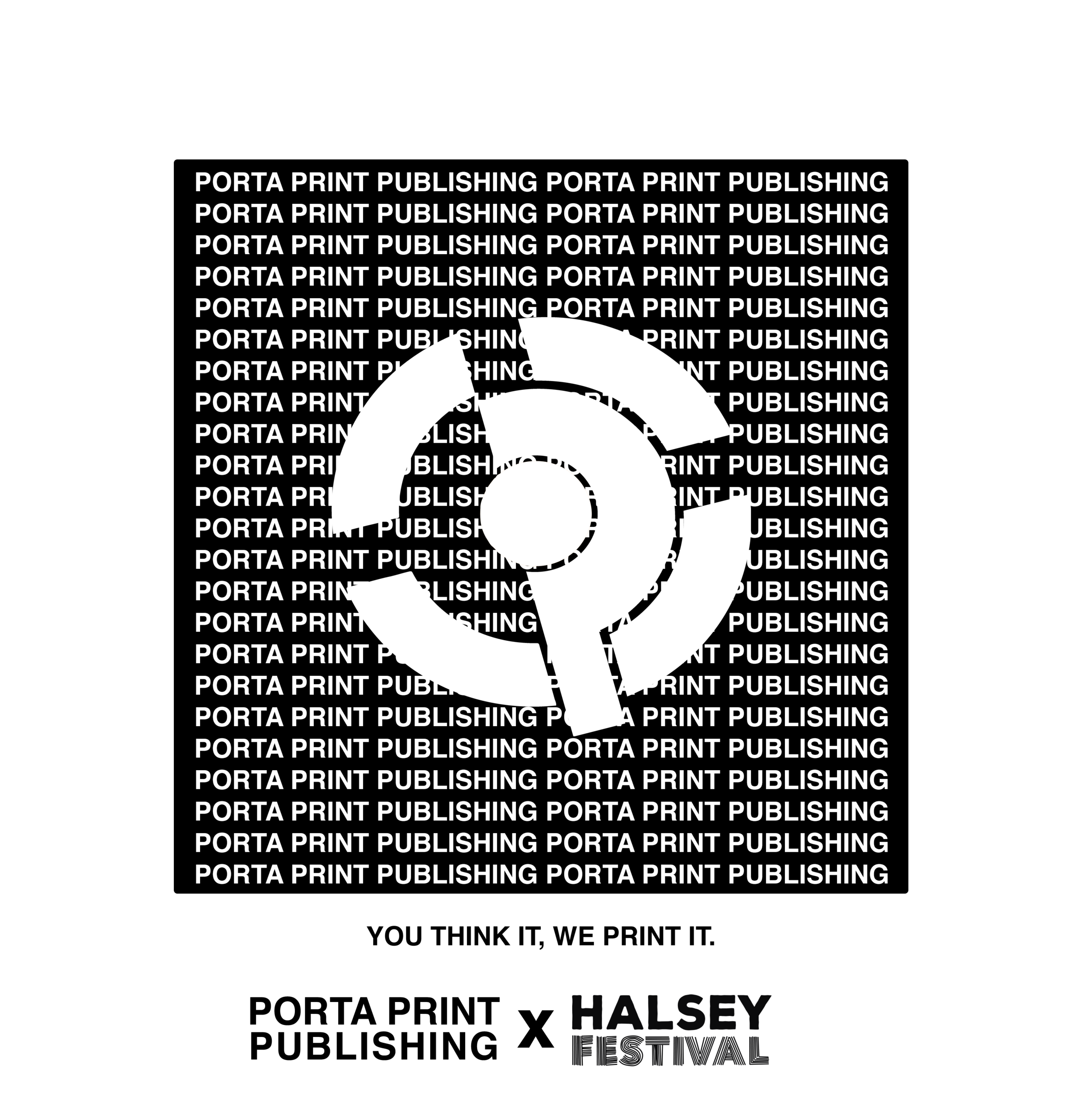
Here’s the final Product:
It all begins with an idea. Maybe you want to launch a business. Maybe you want to turn a hobby into something more. Or maybe you have a creative project to share with the world. Whatever it is, the way you tell your story online can make all the difference.